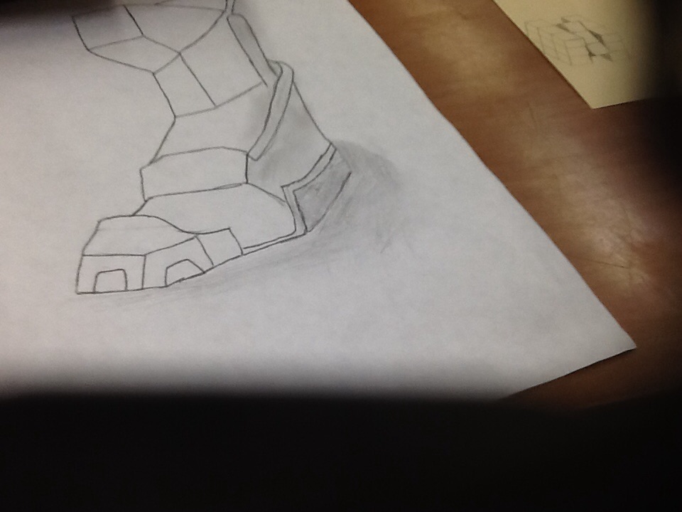
The way I grew with this on is the shading and lines of it look beater than the times I did for this. If I could start agen I could of made the bot look a little beater and a lot likely has iron n it as well. Yes I had made my goals for this piece. How I chose this is that I had a thought how will something like foot wear or an iron boot would look like on paper. I don't know if I had a risk or a sucsessful or falling with it at all.
the most that I had improved is the way I had made the lines and the way the foots action. If I could of started over agen I would of made the caricter more battle ready. Yes I met my goals for this and it was ok. I chose this way of presented this is a heroic drawing.i don't know if I had a risk for this one at all. And I dot think that there is nothing sucsefull.
He most I have grown from this is that I had tried to do my best and I had added some shading to it to look like the negative space is showing as well. If I could start agen I could of made this a little beater in how the lines could look and made sure I took some more time on it. Yes I had reached my goals for this project and it looks good as well. The way I choes to present this work is that I had the shading of this protect for the negative space show that the lines of this project to make it pop out. My biggest risk is that I don't know for sure that the shading will work for this and make it look like crap. I don't know if I have a sucsessful and or a failur for this project at all.
Ws the most in this project that I grew the most from this is that I need to take my time and make sure that all of the lines and the other ones the same shape like the wings for example they were not even at first but now they are just fine. If I could start this again I would take my time more and make more changes to the background of the pitcher. The goals I had for this peace is to make it look like the main person was on a battle deals or in a distant home getting ready for a battle, or it looks like he is being lazy and taking his sweat little time getting their. The way I chose to present this is it have no color and it is a classical black and wight with some shading. Why I had chose this way is because I had no colors at home and it makes it look like this was from back then when there was no color in the pitchers. The biggest risks I had was the background of the pitcher,I was afraid it was not going to turn out good but it turned out iffy I guess. The most successful part of this is that the body and the wings came out grate in the pitcher but the heal it could use some improvement though.
|