The things that I had changed for this is the zipper and the clothing like for the shirt making the creses for some. The thing that I thought that was the hand and the head. 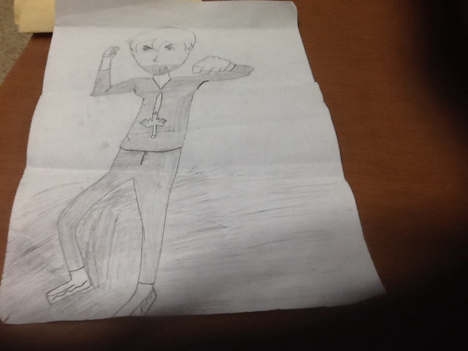
The part that is Going ok is that I got the outline right. The part that did not go well is that The pitcher on the shirt is not good and there is no background. The problems that I had run in to is that the way I had made the outline at first but then I got it in the end. Yes I had made some changes from my original I'm going to put a background and make his shirt look a lot more better. 
I made this look presentable and it looks better than the ruft draft one and it is a lot more better than last time. This ads meaning to this pitcher on the shirt and that the thing that is making him look better. The risked that i took is for this is a look of being a super hero like and mad it ok. 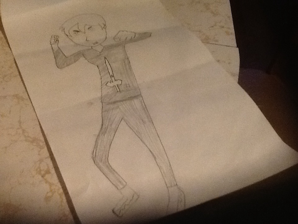
The thing that had inspired me the most is that people draw there own thing like cartoon or manga caricters that is what inspired me there. The inspiration i got is from my friend Veronica and how people had made the character that they made. The way I had imagend it is a caricter that gets ready for battle and he is in his pose for battle. My goals for this pice is that the caricter is like a hero and he is saving people in his home town.
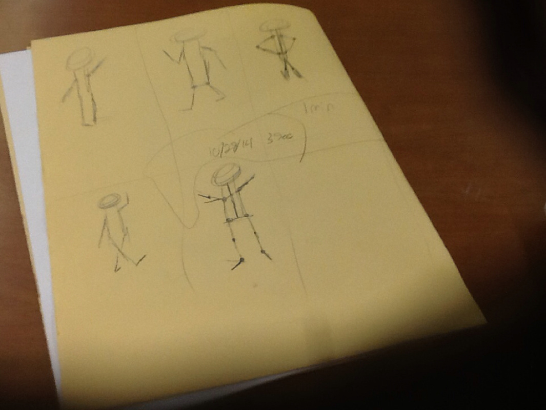
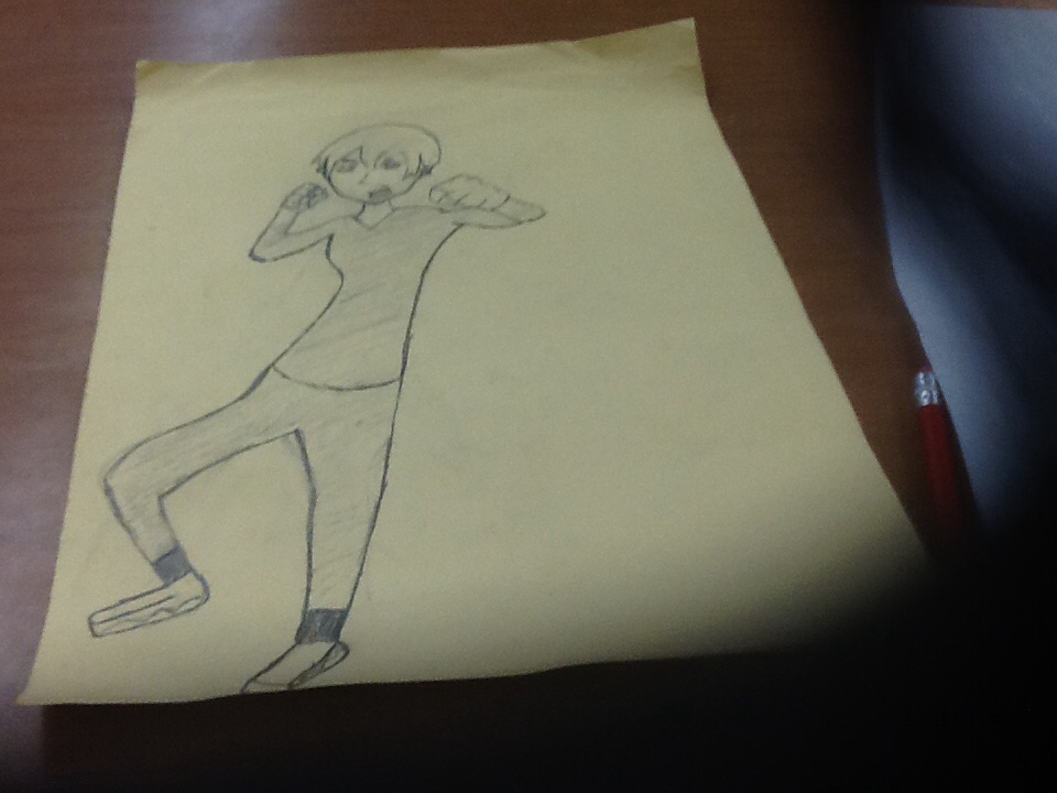
The part that shows that I had improved in is that the lines of the drawing is ok and I could of made the skeleton a lot beater and more like an out line of a person as well. The difficult part is that the skeleton was a little hard to think of making but in the end it got easer to make as we went along. The genaril ideas of the person when we drew them standing in there poses. This skill will help me become a beater artiste for drawing people an other objects. 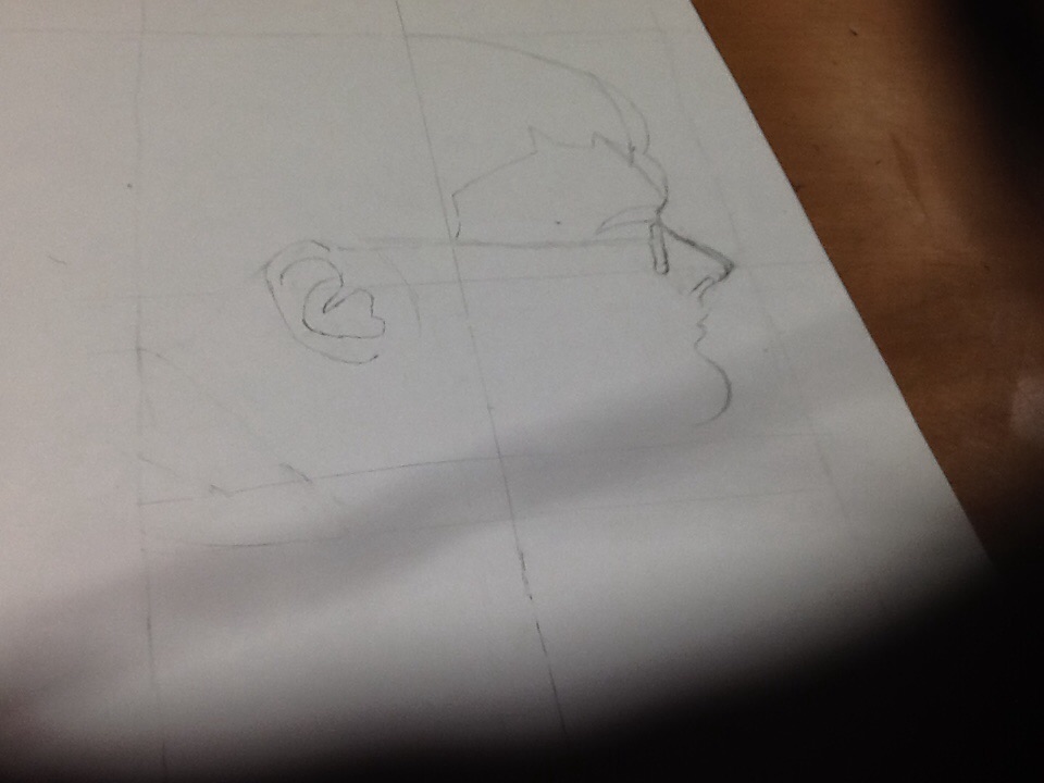
the part that had improved the most is that the outlines of this helped me determined the lines.
This was difficult to deter on the lines and it was a little hard and easy at the same time. This skill will help me with drawing pitchers that has a side of a face I had changed the shape a little and made sure that the lines had mached the pitcher and made some shading as well. The part that is suscsfull about this pice is that it had some of the shading in the space that is making the lines pop out more and it does look good.... I hope. 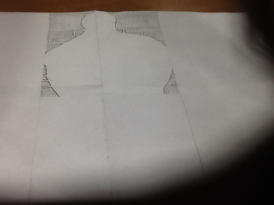
The part that is going well for this peace is that the way I am making the lines for the negative space look more like the lines that cross but it is more joint than it looks with the detail. The art that is not working is that the head looks like it is missing from the pitcher and it does not look right with out the head on the body. The only problem I hade run into is the part with the space with the head and all that empty negative space and how the body looks like the headless horse man. The way I solved it was to fallow the pitcher with the lines on the paper. No changes to it so fare and it is looking great as well. 
I tried to make the lines of the bricks and the wall to make the lines and it is pretty hard to make the shape and it does look a little good. The ways I used the lines of the drawing and how it makes the drawing look more like an outline of a person standing in front of a wall. I took some risks of drawing the outline of the person first than drawing the negative space of the pitcher. 
| AuthorWrite something about yourself. No need to be fancy, just an overview. ArchivesCategories |
 RSS Feed